
VitalBite
FOOD DELIVERY APP

My role
UX Design
Project Duration
2 weeks, 2022
MAIN TOOL USED
Figma
- you're what you eat -
About
background
The current market for food delivery apps is saturated with an abundance of unhealthy dishes, potentially tenting users to make unhealthy choices.
How can we lead users to make healthier dietary choices?
the product
VitalBite is an innovative food delivery application that focuses on providing only healthy meal options at competitive prices
competitive analysis
I evaluated strengths and weaknesses of other food delivery apps to identify opportunities and threats for VitalBite.

Empathise with end users
exploratory interviews
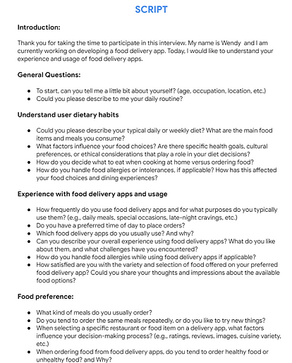
I conducted semi-structured interviews with 10 people who were within my social circle, including peers and family members to gain insights into their eating habits and decision-making processes when using food delivery apps.
Tool used for interview: Google meet
empathy maps
After each interview, I created empathy maps to synthesize research observations and reveal deeper insights about the users and to help me build user persona.
Tool used for organising data: Miro
.jpg)
key insights

People have a hard time finding the time to cook and/or to go to grocery shops.
" I tend to order food very often, especially when I have a busy day at work cause I don't have the time for cooking and neither to go out to the shop" (P3)

Food delivery apps on the market offer a vast selection of unhealthy dishes, which can make it challenging for individuals to find healthier options.
"Whenever I go on the app, I mostly see processed food, which I love don' t get me wrong, but I know it isn't good for me, so I order and then I feel guilty, it's always like this" (P7)

Individuals with strict dietary requirements struggle to find dishes
"I have celiac disease, which makes it quite challenging for me to find gluten-free dishes in most restaurants. Typically, I call ahead and inquire whether they offer a gluten-free version of the dish I'd like to have."

Unhealthy food is normally cheaper compared to healthy food, and that impacts users' food choices
"For me I tend to go with the cheaper option and most of the time the cheaper option is not the healthiest one" (P1)
user personas


user flow
User flow was designed to map out the user's path through the app and highlight any areas that may cause confusion.
Tool used: FigJam

Define
HMWs (how might we)
How might we was used to explore potential problems to solve.
How might we make it easier for users with specific dietary needs (e.g. gluten-free, vegan) to find and order suitable meals on the app?
How might we simplify the app's navigation and ordering process to make it more accessible and user-friendly for all types of users, regardless of their technical skills?
How might we enhance the app's search and filter functions to make it easier for users to find and discover new restaurants and cuisines based on their location, cuisine preferences, ratings and budget?
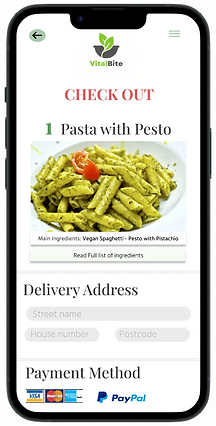
How might we improve the app's payment and checkout process to make it more seamless, secure, and flexible for users?
How might we ensure fees transparency within the app
How might we make easier for the user to find promotions and deals on the app
Ideate
storyboards
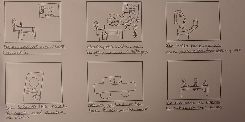
Created a big picture storyboard to visualise user's needs and their context.
mood board
Brainstormed potential product names and thoughtfully selected the brand's core values to steer the visual design to guide the visual design in a direction that felt green, healthy, inclusive, accessible and affordable.
The theme chosen for the app aims to reflect the essence of healthy living, with a palette of green, and white for simplicity.
Vital (essential to life in Latin) + Bite = VitalBite
.jpg)
logo design
The logo features a brown bowl, symbolizing mealtime, and two green leaves, representing nature. The brown colour of the bowl is a nod to the earth, reflecting the brand's commitment to sustainability and natural ingredients.

typography
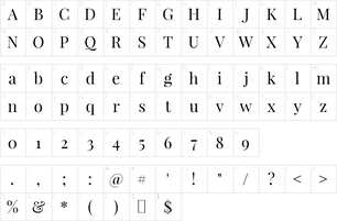
I chose Playfair Display a playful design font to use throughout the app because it creates a soft and friendly feel.
Prototype
wireframes
Created wireframes that address users' key needs based on insights gathered from user interviews.
Home Screen
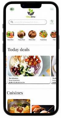
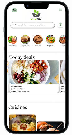
Today's deals are conveniently accessible on the home screen, aiding in making informed decisions.
.png)
Users can easily make decisions by selecting their preferred cuisine, which will then display a list of restaurants specializing in that particular culinary style.
"I would appreciate having access to a variety of cuisine options, and it would also be great to have visibility on any available deals or offers." (P7)
Restaurant menu
Users can also view the most popular dishes offered by a restaurant, as well as the deals available
.png)
Filter feature to allow user to search and filter out restaurants and dishes.
Each meal is accompanied by a name and a picture to provide a visual representation of the dish.
"I would like to see what are the most popular dishes in a restaurant, and if the restaurant offers deals." (P9)
Overview of selected dish
.png)
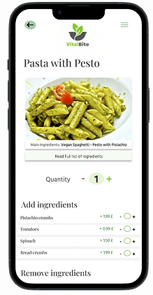
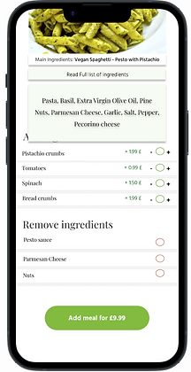
A full list of ingredient is available and user is free to add/ remove certain items.
"It would be good if I would be able to see the full list of ingredients contained in a meal, as it would help me to make a decision". (P3)
lo-fi prototype
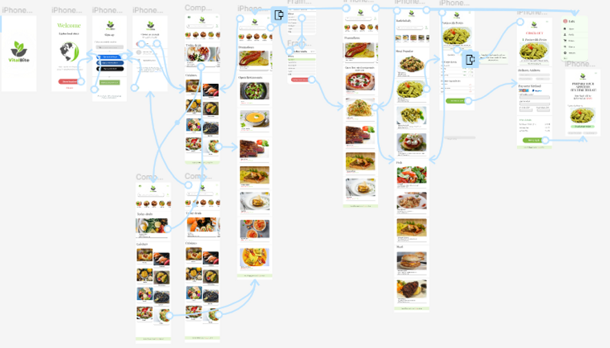
I created a lo-fi prototype for VitalBite, focusing on its functionality and flow, to ensure that the basic user needs are met effectively.

Hi-fi Design mockups
My primary objective while creating this design, was to make it simple, in order to facilitate straightforward interactions, but also I wanted to add a touch of creativity (see how I displayed the range of cuisines). In addition, to draw attention to the essential promotions and save space effectively, I opted to present the "Today deals" and promotions at the top using a carousel. This choice serves multiple purposes: highlighting key elements, optimizing screen real estate, and fostering increased user engagement
Home Screen

Filter feature


Overview of selected dish
Overview of restaurants open


Overview of selected restaurant


Check out

hi-fi prototype
Testing
moderated usability testing
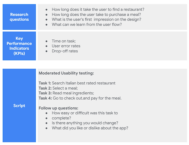
I conducted moderated think-aloud usability testing to evaluate how users interact with the prototype.
I mainly wanted to test the workflows, visual hierarchy and UI components
5 Participants - 20 mins
Tool used for collecting data: Lookback participate

insights
100 % Completion rate
All testers were able to select a dish, add and remove an ingredient and to checkout.
80 seconds
Testers were able to complete the task assigned in a little over 1 minute.
areas of friction
-
Users find the process of adding ingredients confusing.
-
The colour chosen to express delivery times is too light, making it inaccessible for some users.
-
Users expressed a desire to view ratings for both restaurants and dishes.
Design Iterations
Before Testing
After Testing
4 out of 5 users found that -/+ for adding ingredients to be confusing, I have removed the "-" icon and retained only the "+" icon for a clearer and more intuitive user experience.
Before Testing
After Testing
3 out of 5 users struggled to see delivery times.
4 out of 5 users suggested that having access to restaurant ratings would be beneficial in assisting them to make informed decisions.
Colour chosen (#26762C) is more accessible on white background.
Ratings and feedback were incorporated to assist users in making informed comparisons with other restaurants when making their choice.


Final design

Final thoughts
how successful is my design?
Since this is a fictional project, there is no way to measure success except for testing with people to see what they think about it.
But, if this product was built for real, I would measure the success of this design by adopting the following metrics:
Usability metrics:
-
SUS
-
Time on task
-
Task error rate
User engagement metrics:
-
Download rate
-
Daily and monthly Active users
-
Average session rate