.png)
FLOWERS
PREMIUM FLORIST

My role
UX Design (Personal Project)
Project Duration
2 weeks, 2022
MAIN TOOL USED
Adobe XD
-Every flower is a soul blossoming in nature-
About
project overview
As part of the Google UX Design Professional Certificate course, I was challenged in crafting a responsive website.
Around the timeframe of this course, I had my first experience as a customer with an online florist shop.
This experience, as well as the fact that I was surrounded by beautiful flowers during a Portuguese spring, tickled my curiosity to delve deeper into the realm of the online floral industry, and inspired me to craft a responsive website dedicated for an online florist shop.
market analysis
I analysed the digital floral market to understand trends, challenges, opportunities, as well as demographics of customers. Based on findings, the online digital floral market has increased significantly during the COVID-19 pandemic, as people thought alternative ways to send flowers and gifts to loved ones due to restrictions and social distancing measures. Post-pandemic, the growth rate stabilized but still remains higher than pre-pandemic levels due to the convenience and ease of online flower shopping
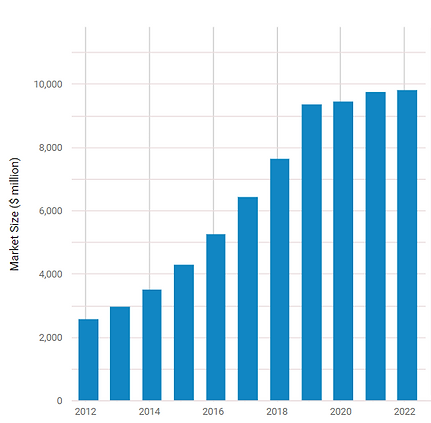
Online Flower Shops in the US - Market Size 2012–2022
Taken from ibisworld.com
competitive analysis
I put down all UX elements and other features of direct competitors to evaluate strength and weaknesses.
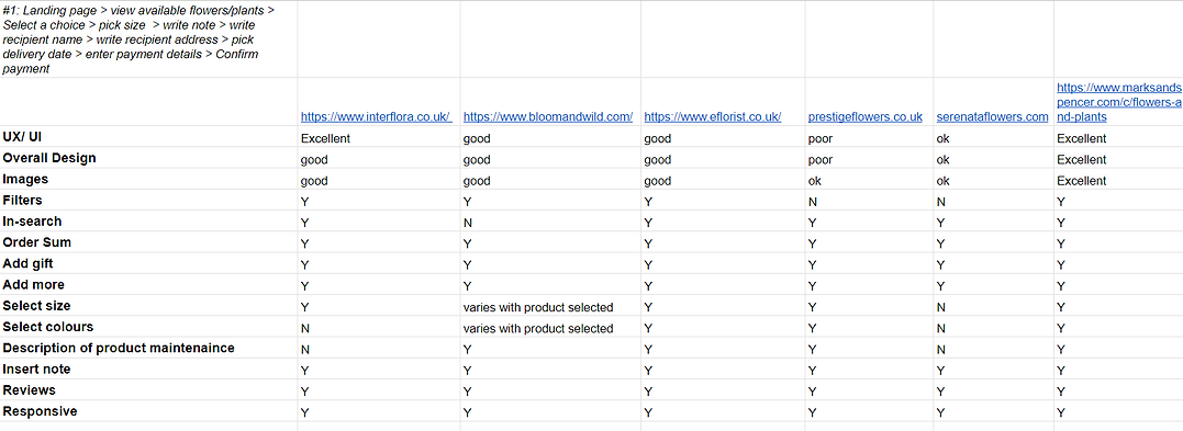
Empathising with users & define the problems
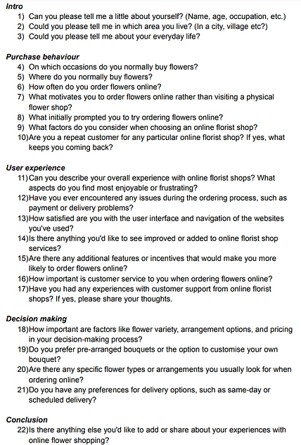
semi-structured interviews
I conducted in-person interviews with 7 people recruited through social media (Facebook) and family connections, to ensure a diverse range of demographics (age range 20 - 75, 3 males).
The goal of the interviews was to comprehensively understand people's needs and motivations when purchasing flowers online, while also delving into their preferred online florist shops and to understand what featured they liked and disliked.
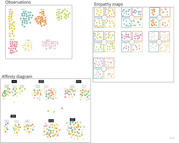
empathy maps and affinity diagram
I organised the data gathered from the interviews into affinity diagrams with the aim to spot themes and insights.
Additionally, I used empathy maps to to gain a deeper understanding of the user's perspective, attitudes, and behaviour.
Tool used for organise and analyse data: Miro
.jpg)
hierarchical task analysis (HTA)
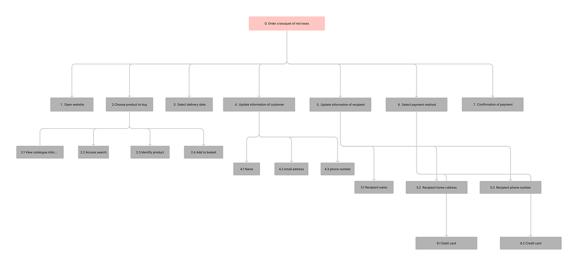
During the interviews, I also asked the users to complete the task: "to order a bouquet of roses" on their favourite online florist shop to construct the HTA.
I used this method to understand how users currently perform this task on similar florist websites, identifying current issues and areas for improvement.
Tool used for creating HTA diagram: Figjam
insights

Users likes to order flowers online due to the convenience
"It's delightful to select beautiful blooms right from the comfort of my home." P3

Users would like to take around 5 minutes to order their product
"I appreciate websites that are easy to use, and the all process last less than 5 minutes." P7

Reliable delivery and transparent fees
"A reliable delivery is essential, it brings peace of mind, especially when sending flowers for special occasions." P1
"I want to know earlier the total that I have to pay" P4

Users would like to have pre-arranged bouquet and customizing options
"I usually prefer pre-arranged bouquets because they are already beautiful, but having customizing options is important too. It allows me to add a personal touch." P7

Users would like to be able to add personalised note to include with the delivery
"I love being able to include a personalized note with the flowers I choose. It adds a special touch and makes the gift more meaningful." P5

Users would like to be able to choose different size and colours of flowers in bouquets
"Having the option to select the size and colors of flowers or plants is wonderful. It allows me to create a bouquet that suits the recipient's preferences." P2
Customer support available in case of queries and/or problems
Tutorial to enhance the experience for less tech-literate users

"It is reassuring to know that there is someone to contact in case of issues. I once had an issue with the delivery, and they were helpful in resolving it promptly." P3

" I would like to be able to have videos to guide me in how to order flowers online, as I'm not very good with tech" P2
user personas
problem statement
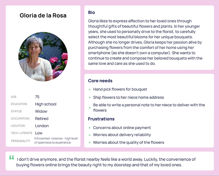
Gloria, a woman in her 70s who doesn't drive, needs to purchase a bouquet of peonies and roses, and get it delivered to her niece's home address as it's her birthday tomorrow

problem statement
Jennifer, a busy woman who lives far from her best friend, urgently needs to send her a bouquet of flowers along with a personal note by tomorrow morning to celebrate her birthday
user flows
User flow was designed to map out the user's path through the website and highlight any areas that may cause confusion.
Tool used: FigJam


Ideate
crazy 8
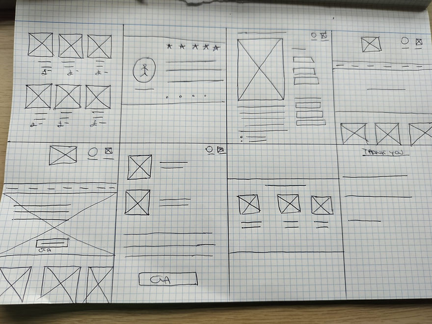
To stimulate my creative side, I engaged in the Crazy 8 exercise, allocating just one minute for each square. This exercise proved highly beneficial for brainstorming, offering a quick and efficient way to foster creativity without consuming much time.
Prototype
site map
To outline the hierarchical structure of different pages and sections, as well as to plan navigation flows, I created a site map.

wireframes and mockups
I use the insights gathered from the interviews to create wireframes; afterward, I tested these wireframes with my peers, and based on the feedback received I designed the mockups.
Home page
wireframes
mockups

I introduced an expandable menu with the dual purpose of reducing users' cognitive load, facilitating identification of desired options, making navigation this process more efficient, as well as to conserve space.
Product Grid, to allow users to browse and compare multiple products quickly to help make informed decisions about which item to click on for more detailed information or to add to their shopping cart.

Selected product page
wireframes
mockups

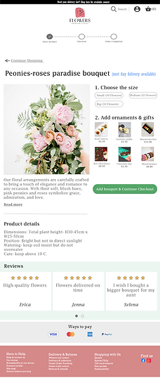
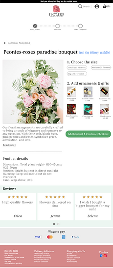
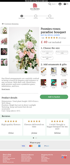
An image of the selected item is showcased, allowing the user to access the product description and care instructions. Furthermore, users have the option to select the size and to add any desired ornaments to personalise their choice.
Included reviews from other customers to aids decision making, as well as to build trust and credibility.
Checkout page
wireframes
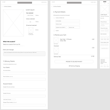
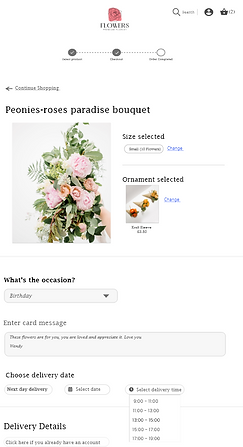
Users have the option to type a personal note that will be delivered to the recipient with the chosen product
mockups

Order Confirmation page
wireframes
mockups
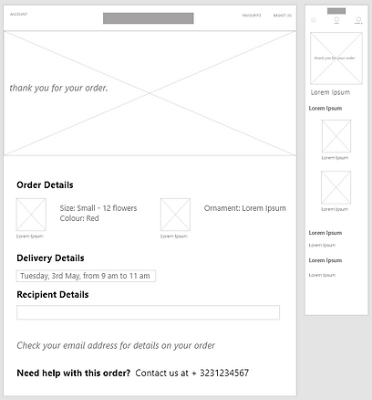
If users have any queries or concerns after ordering the item, they can reach out to our support team for assistance.
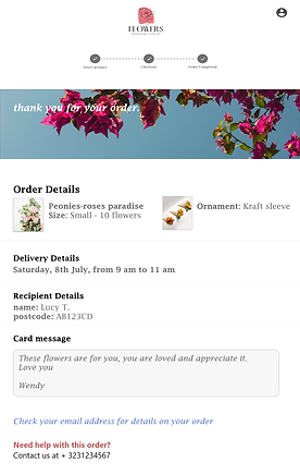
high-fidelity prototype
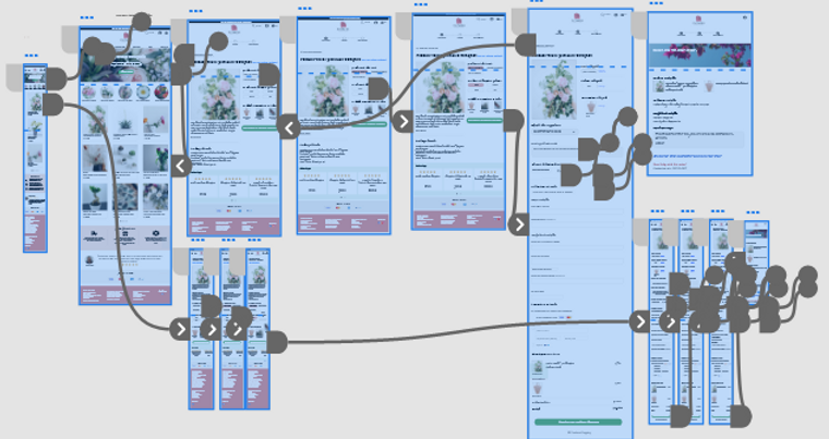
Testing
moderated usability testing
I conducted in-person moderated think-aloud usability testing for the website version with the aim of evaluating the workflows, visual hierarchy, and UI components.
The participants recruited were family members and friends.
5 Participants - 25 mins

Rainbow Spreadsheet
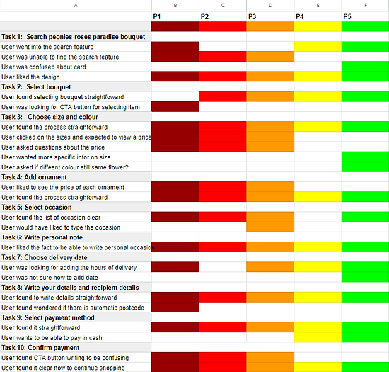
During the usability testing, I organised the data in a Rainbow spreadsheet, in order to easily spot behavioural patterns.
insights
-
Users expressed that the search button lacked intuitiveness, leading to difficulties in finding desired items.
-
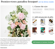
In the "Selecting product page," users found the size selection feature lacking information about different prices, which made it challenging to make informed choices.
-
Users expressed the desire for the ability to select a specific delivery time to better suit their convenience.
-
On the "Checkout page," users noted that the Call-to-Action (CTA) button's wording was unclear and could be improved for better user understanding.
100 % Completion rate
All testers were able to complete assigned tasks.
areas of friction
Design Iterations
added search bar in home page
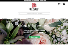
In order to help user to quickly locate the desired products, I made the decision to incorporate a search bar while removing the search icon from the top of the webpage, as some users founded difficult to locate this feature.
Before Testing
After Testing


added detailed price information
On the "product selection page," I revamped the layout to prominently display the product price, along with the corresponding prices for each selected size.
Before Testing
After Testing

user can pick delivery time slot
On the checkout page, I have included a dropdown menu that allows you to select their preferred delivery time slot.
revamped CTA buttons wording
During usability testing, I noticed that users whose first language wasn't English were uncertain about the meanings of the CTA button labels. Additionally, some users found the intended actions unclear.
I revamped the wording, choosing more concise, action-oriented words.
Before Testing
After Testing


Final Design


Design System & Branding
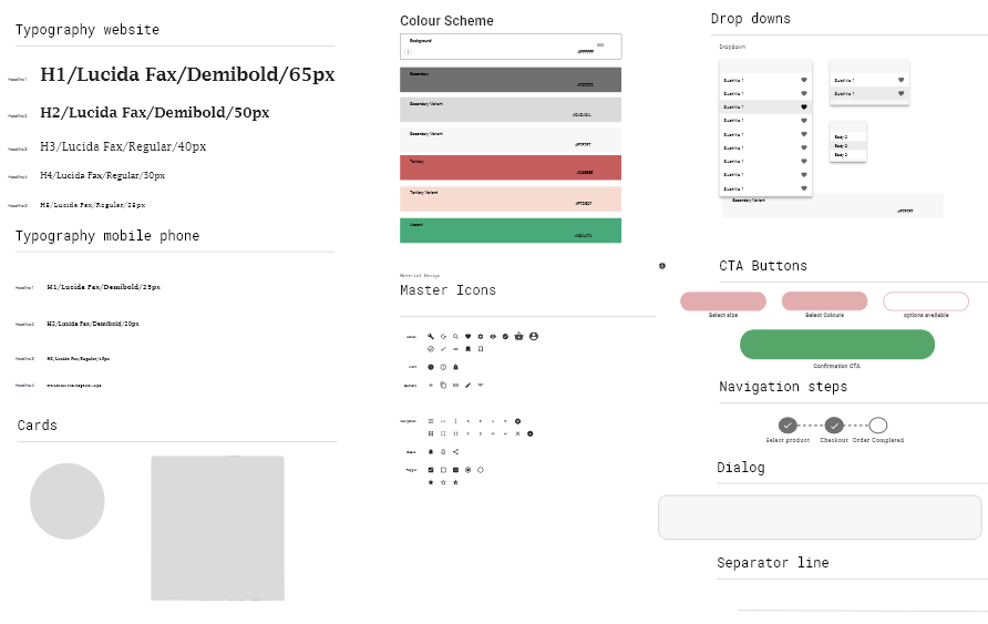
design system
Prior to implementing visual designs on the wireframes, I established a comprehensive design system to ensure a cohesive and consistent user experience.
business name
For creating the business name, I leveraged ChatGPT for brainstorming ideas. After careful consideration, I selected "Flowers Premium Florist," a choice that encapsulated simplicity and succinctly represented what the business is selling.
logo design
I crafted the logo with simplicity and elegance in mind, as these are the qualities I aimed to convey to the audience.
Tool used to create logo: Canva
.png)
typography: Hatton - Darker Grotesque colour (#000000)
rose colour: #F7838D and (#000000)
Final thoughts
how successful is my design?
Since this is a fictional project, there is no way to measure success except for testing with people to see what they think about it(like I did with 5 peers).
However if this product was built for real, I would measure the success of this design by adopting the following metrics:
Usability metrics:
-
Success rate
-
Time on task
-
Task error rate
-
Task level satisfaction
User engagement metrics:
-
Conversion rate
-
New vs. returning visitors
-
Unique visitors